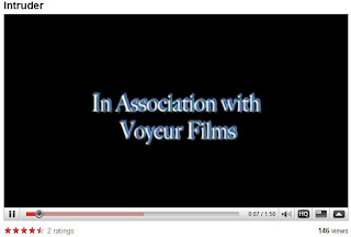
We chose this font to put as our titles using LiveType... We chose this effect because we thought it went nicely with the mysterious theme of our film... it also emphasized the ghostly effect we were trying to create! The blue represent the coldness aspect and the way the words shake emphasize the scary... quaking effect...

No comments:
Post a Comment